In my previous posts I touched on some of the complexities of braille music and how it bears very little resemblance to print music. I know that sounds really obvious, but what I mean by this, is that the cognitive process of interpreting the symbols into sound is very different. The process of interprtetting braille music is linear and involves piecing together layers whereas print music is pictorial.
When it comes to graphic scores one might assume that there are more parallels between the tactile graphic and the printed graphic in terms of making sense of symbol into sound. This may indeed be the case, however, there are a few pitfalls with this approach. Firstly, the eye can take in the whole image in one go whereas the student with a vision impairment can only read what is under the finger and has to form a mental map, piecing the bits together. Secondly, and possibly more surprisingly, the preconceived idea that several musical ideas or parts can be layered one on top of another to sound simultaneously or that high pitch might be higher up the page and low pitch towards the bottom sometimes needs to be actually taught and explained as a concept. It was only when I started introducing tactile graphic scores to my students that it became apparent that some of the visual concepts didn’t translate that easily into tactile ones. If we learn something by seeing, we must take care not to assume that a child who hasn’t accessed the same visual learning experience understands the concept.
Below is a picture of two tactile scores created by my year 7 students (aged 11) which illustrate the point. I did an exercise where I played various chords and melodies and asked them to create a graphic symbol or series of symbols to represent the sounds using wax sticks on a whiteboard. I made these quite simple with really contrasting low to high notes. I tried adding notes one at a time to see if they would think about note density and I also tried contrasting groups of short, detached notes with long held notes. I was expecting my students to demonstrate meaningful symbols that I could related to with my experience and knowledge of print notation. I assumed that the students would know to position high pitched notes above lower pitched notes and that notes would move neatly from left to right. I was surprised by some of the resulting scores.
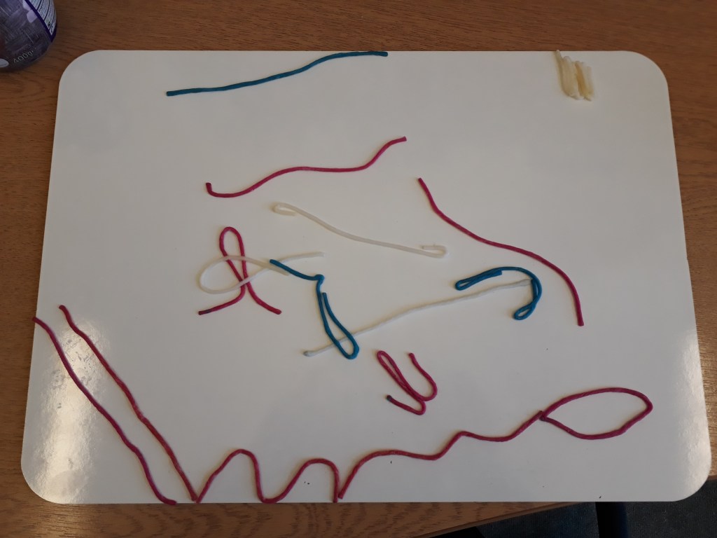
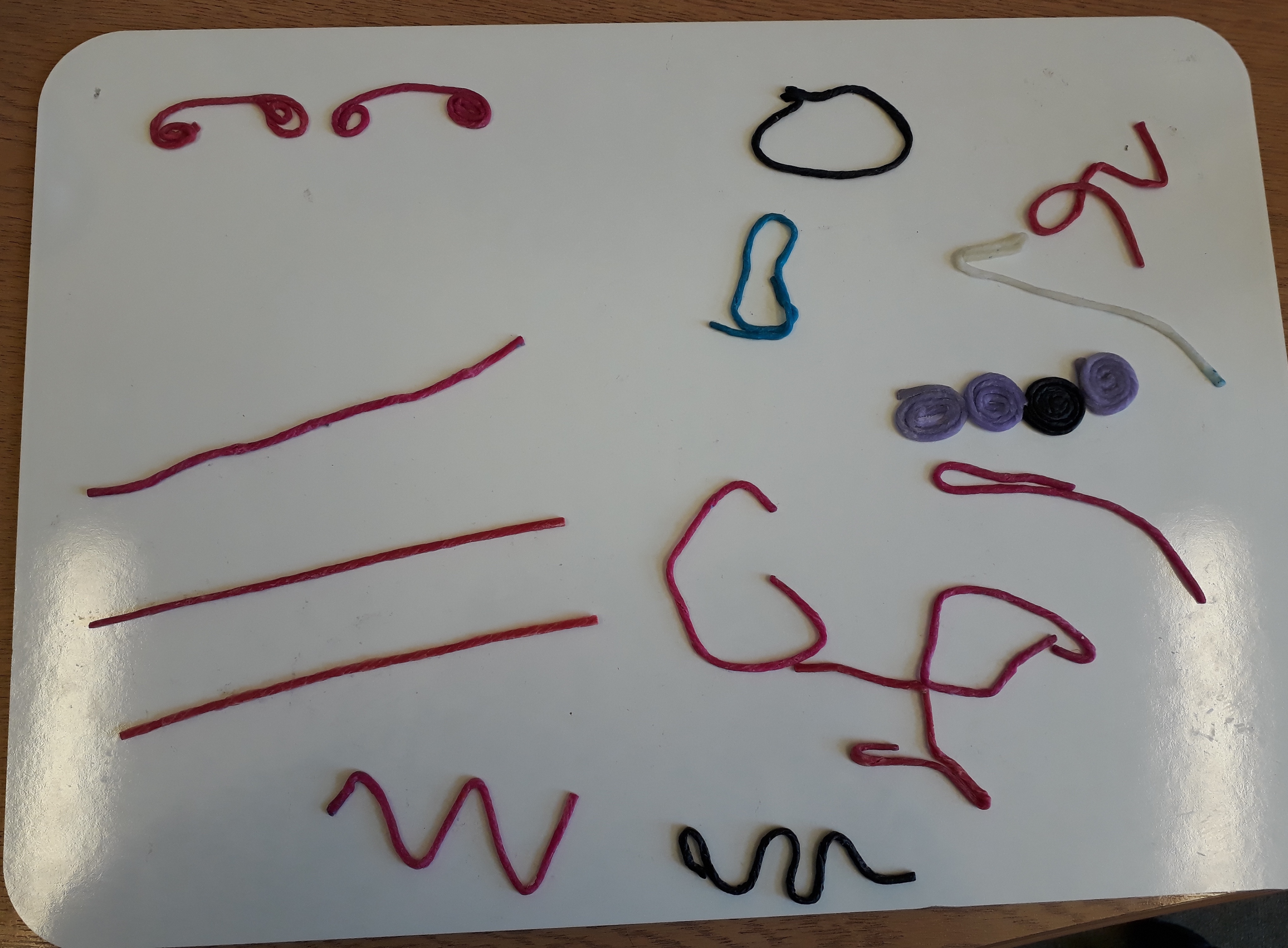
The first example shown above has seemingly random lines which move across the whiteboard in all different directions with loops and wiggles and giving very little logical resemblance to the music that had been the stimulus. The student has a good aptitude for learning and whilst not an experienced musician, certainly had a good awareness of pitch and rhythm. I wonder if this says more about their spatial awareness or perhaps a lack of fine motor skills than it does their musical understanding. The second example, shown below, is a lot more organised with layers that could respresent parts and which give some indication of melodic shape and separation of notes. Interestingly, this student had previously had some usable sight and so had some memory of seeing print notation. Make of it what you will, but I am always trying to think of ways to help my students make sense of notation, particularly rhythm which is often an area of weakness.

Some more here:
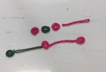
Short and long notes are easily identifiable in the image shown left.
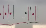
The student here was representing the difference between 3/4 and 6/8. A tricky concept for some. The dot is the accented note and the line the weaker beat.
Graphic scores are always open to a certain amount of interpretation, of course, but I have always considered them a useful way in to matching sound with symbol and exploring the elements of music. Sometimes I get students to draw the shape of a melody using German film. The actual process of doing this needs some practise and of course, some students have quite poor fine motor skills so activities that get students manipulating or drawing are beneficial in this respect.
Some of the tactile graphics that I use are simply swell paper versions of the print but made larger so that they are easier to follow. If you are using these as a focus to listening you must bear in mind that you can only follow one line at a time so avoid having simultaneous events that need to be followed.
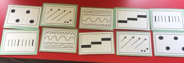
One composing resource that I have used that is effective is to create a series of cards with simple graphics dertived from a piece of music that becomes the stimulus. Students match the card with the corresponding part of the music and then reimagine the symbols into their own compositions. The picture below uses graphics inspired by the last movement of Shostakovich’s 5th Symphony. A great piece!
I have also used graphics to help students to structure their pieces to include contrasting sections. In this case each of the graphics represents a different musical idea. In this example the theme is Space and the students are encouraged to explore contrasting timbres for each one. In this case, I divide the students in groups to take charge of one or two of the images each before coming together as a class to perform the whole. The class agree how to read the “score” during the performance, for instance, do they start at the top row and read left to right before moving to the bottom row? Or do they proceed in a circular motion?
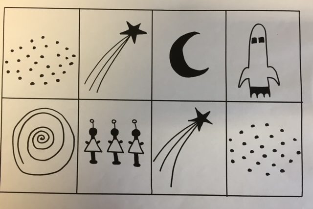
Of course, the crescent moon graphic takes some explaining as this is a fairly complex visual concept. My focus for this is in composing contrasting ideas. The spiral graphic is meant to represent a black hole and an important part of this activity is the discussion and demonstrating ideas before actually setting them off to compose their own piece.
I would encourage any music teachers working with students with a vision impairment to try out some tactile graphics in their lessons. Let me know what works well for you. I’m always keen to try out some new ideas and would love to hear from you!
